排版
标题
HTML 中的所有标题标签,<h1> 到 <h6> 均可使用。另外,还提供了 .h1 到 .h6 类,为的是给内联(inline)属性的文本赋予标题的样式。
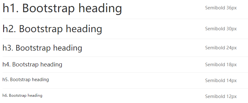
<h1>h1. Bootstrap heading</h1>
<h2>h2. Bootstrap heading</h2>
<h3>h3. Bootstrap heading</h3>
<h4>h4. Bootstrap heading</h4>
<h5>h5. Bootstrap heading</h5>
<h6>h6. Bootstrap heading</h6>
<!-- 或者 -->
<div class="h1">h1. Bootstrap heading</div>
<div class="h2">h2. Bootstrap heading</div>
<div class="h3">h3. Bootstrap heading</div>
<div class="h4">h4. Bootstrap heading</div>
<div class="h5">h5. Bootstrap heading</div>
<div class="h6">h6. Bootstrap heading</div>
在标题内还可以包含 <small> 标签或赋予 .small 类的元素,可以用来标记副标题。
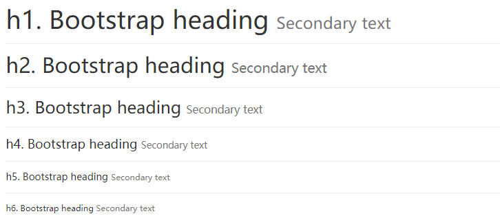
<h1>h1. Bootstrap heading <small>Secondary text</small></h1>
<h2>h2. Bootstrap heading <small>Secondary text</small></h2>
<h3>h3. Bootstrap heading <small>Secondary text</small></h3>
<h4>h4. Bootstrap heading <small>Secondary text</small></h4>
<h5>h5. Bootstrap heading <small>Secondary text</small></h5>
<h6>h6. Bootstrap heading <small>Secondary text</small></h6>
页面主体
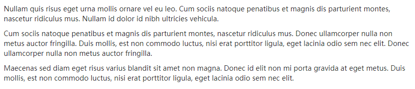
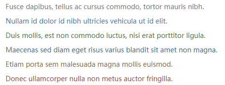
Bootstrap 将全局 font-size 设置为 14px,line-height 设置为 1.428。这些属性直接赋予 <body> 元素和所有段落元素。另外,<p> (段落)元素还被设置了等于 1/2 行高(即 10px)的底部外边距(margin)。
<div>
    <p>Nullam quis risus eget urna mollis ornare vel eu leo. Cum sociis natoque penatibus et magnis dis parturient montes, nascetur ridiculus mus. Nullam id dolor id nibh ultricies vehicula.</p>
    <p>Cum sociis natoque penatibus et magnis dis parturient montes, nascetur ridiculus mus. Donec ullamcorper nulla non metus auctor fringilla. Duis mollis, est non commodo luctus, nisi erat porttitor ligula, eget lacinia odio sem nec elit. Donec ullamcorper nulla non metus auctor fringilla.</p>
    <p>Maecenas sed diam eget risus varius blandit sit amet non magna. Donec id elit non mi porta gravida at eget metus. Duis mollis, est non commodo luctus, nisi erat porttitor ligula, eget lacinia odio sem nec elit.</p>
</div>
中心内容
通过添加 .lead 类可以让段落突出显示。

<p class="lead">Vivamus sagittis lacus vel augue laoreet rutrum faucibus dolor auctor. Duis mollis, est non commodo luctus.</p>
内联文本元素
高亮的文本

You can use the mark tag to <mark>highlight</mark> text.
被删除的文本

<del>This line of text is meant to be treated as deleted text.</del>
无用文本

<s>This line of text is meant to be treated as no longer accurate.</s>
插入文本

<ins>This line of text is meant to be treated as an addition to the document.</ins>
带下划线的文本
<u>This line of text is meant to be treated as an addition to the document.</u>
小号文本
对于不需要强调的inline或block类型的文本,使用 <small> 标签包裹,其内的文本将被设置为父容器字体大小的 85%。标题元素中嵌套的 <small> 元素被设置不同的 font-size 。
你还可以为行内元素赋予 .small 类以代替任何 <small> 元素。
<small>This line of text is meant to be treated as fine print.</small>
着重

<strong>rendered as bold text</strong>
斜体

<em>rendered as italicized text</em>
提示
在 HTML5 中可以放心使用 <b> 和 <i> 标签。<b> 用于高亮单词或短语,不带有任何着重的意味;而 <i> 标签主要用于发言、技术词汇等。
对齐

<p class="text-left">Left aligned text.</p>
<p class="text-center">Center aligned text.</p>
<p class="text-right">Right aligned text.</p>
<p class="text-justify">Justified text.</p>
<p class="text-nowrap">No wrap text.</p>
改变大小写

<p class="text-lowercase">Lowercased text.</p>
<p class="text-uppercase">Uppercased text.</p>
<p class="text-capitalize">Capitalized text.</p>
缩略语
当鼠标悬停在缩写和缩写词上时就会显示完整内容,Bootstrap 实现了对 HTML 的 <abbr> 元素的增强样式。缩略语元素带有 title 属性,外观表现为带有较浅的虚线框,鼠标移至上面时会变成带有“问号”的指针。如想看完整的内容可把鼠标悬停在缩略语上(对使用辅助技术的用户也可见), 但需要包含 title 属性。
基本缩略语

<p>An abbreviation of the word attribute is <abbr title="attribute">attr</abbr>.</p>

<p><abbr title="HyperText Markup Language" class="initialism">HTML</abbr> is the best thing since sliced bread.</p>
地址

<address>
  <strong>Twitter, Inc.</strong><br>
  1355 Market Street, Suite 900<br>
  San Francisco, CA 94103<br>
  <abbr title="Phone">P:</abbr> (123) 456-7890
</address>

<address>
  <strong>Full Name</strong><br>
  <a href="mailto:#">first.last@example.com</a>
</address>
引用
默认样式的引用

<blockquote>
  <p>Lorem ipsum dolor sit amet, consectetur adipiscing elit. Integer posuere erat a ante.</p>
</blockquote>
多种引用样式

<blockquote>
  <p>Lorem ipsum dolor sit amet, consectetur adipiscing elit. Integer posuere erat a ante.</p>
  <footer>Someone famous in <cite title="Source Title">Source Title</cite></footer>
</blockquote>
另一种展示风格

<blockquote class="blockquote-reverse">
  <p>Lorem ipsum dolor sit amet, consectetur adipiscing elit. Integer posuere erat a ante.</p>
  <footer>Someone famous in <cite title="Source Title">Source Title</cite></footer>
</blockquote>
列表
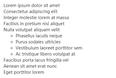
无序列表
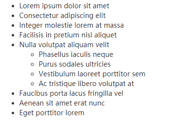
<div>
    <ul>
      <li>Lorem ipsum dolor sit amet</li>
      <li>Consectetur adipiscing elit</li>
      <li>Integer molestie lorem at massa</li>
      <li>Facilisis in pretium nisl aliquet</li>
      <li>Nulla volutpat aliquam velit
        <ul>
          <li>Phasellus iaculis neque</li>
          <li>Purus sodales ultricies</li>
          <li>Vestibulum laoreet porttitor sem</li>
          <li>Ac tristique libero volutpat at</li>
        </ul>
      </li>
      <li>Faucibus porta lacus fringilla vel</li>
      <li>Aenean sit amet erat nunc</li>
      <li>Eget porttitor lorem</li>
    </ul>
</div>
有序列表

<div>
    <ol>
      <li>Lorem ipsum dolor sit amet</li>
      <li>Consectetur adipiscing elit</li>
      <li>Integer molestie lorem at massa</li>
      <li>Facilisis in pretium nisl aliquet</li>
      <li>Nulla volutpat aliquam velit</li>
      <li>Faucibus porta lacus fringilla vel</li>
      <li>Aenean sit amet erat nunc</li>
      <li>Eget porttitor lorem</li>
    </ol>
</div>
无样式列表
<div>
    <ul class="list-unstyled">
      <li>Lorem ipsum dolor sit amet</li>
      <li>Consectetur adipiscing elit</li>
      <li>Integer molestie lorem at massa</li>
      <li>Facilisis in pretium nisl aliquet</li>
      <li>Nulla volutpat aliquam velit
        <ul>
          <li>Phasellus iaculis neque</li>
          <li>Purus sodales ultricies</li>
          <li>Vestibulum laoreet porttitor sem</li>
          <li>Ac tristique libero volutpat at</li>
        </ul>
      </li>
      <li>Faucibus porta lacus fringilla vel</li>
      <li>Aenean sit amet erat nunc</li>
      <li>Eget porttitor lorem</li>
    </ul>
</div>
内联列表

<div>
    <ul class="list-inline">
      <li>Lorem ipsum</li>
      <li>Phasellus iaculis</li>
      <li>Nulla volutpat</li>
    </ul>
</div>
描述
<div>
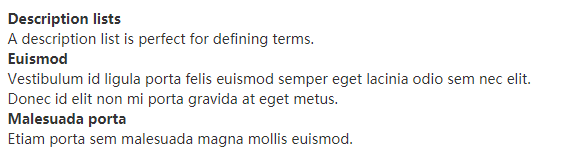
<dl>
<dt>Description lists</dt>
<dd>A description list is perfect for defining terms.</dd>
<dt>Euismod</dt>
<dd>Vestibulum id ligula porta felis euismod semper eget lacinia odio sem nec elit.</dd>
<dd>Donec id elit non mi porta gravida at eget metus.</dd>
<dt>Malesuada porta</dt>
<dd>Etiam porta sem malesuada magna mollis euismod.</dd>
</dl>
</div>
水平排列的描述
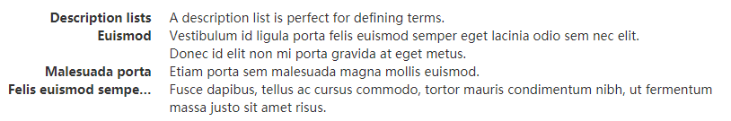
<div>
    <dl class="dl-horizontal">
      <dt>Description lists</dt>
      <dd>A description list is perfect for defining terms.</dd>
      <dt>Euismod</dt>
      <dd>Vestibulum id ligula porta felis euismod semper eget lacinia odio sem nec elit.</dd>
      <dd>Donec id elit non mi porta gravida at eget metus.</dd>
      <dt>Malesuada porta</dt>
      <dd>Etiam porta sem malesuada magna mollis euismod.</dd>
      <dt>Felis euismod semper eget lacinia</dt>
      <dd>Fusce dapibus, tellus ac cursus commodo, tortor mauris condimentum nibh, ut fermentum massa justo sit amet risus.</dd>
    </dl>
</div>
自动截断
通过 text-overflow 属性,水平排列的描述列表将会截断左侧太长的短语。在较窄的视口(viewport)内,列表将变为默认堆叠排列的布局方式。
代码
内联代码

<div>
For example, <code><section></code> should be wrapped as inline.
</div>
用户输入

To switch directories, type <kbd>cd</kbd> followed by the name of the directory.<br>
To edit settings, press <kbd><kbd>ctrl</kbd> + <kbd>,</kbd></kbd>
代码块

<pre><p>Sample text here...</p></pre>
还可以使用 .pre-scrollable 类,其作用是设置 max-height 为 350px ,并在垂直方向展示滚动条。
变量

<var>y</var> = <var>m</var><var>x</var> + <var>b</var>
程序输出

<samp>This text is meant to be treated as sample output from a computer program.</samp>
表格
基本实例

<div>
    <table class="table">
      <caption>Optional table caption.</caption>
      <thead>
        <tr>
          <th>#</th>
          <th>First Name</th>
          <th>Last Name</th>
          <th>Username</th>
        </tr>
      </thead>
      <tbody>
        <tr>
          <th scope="row">1</th>
          <td>Mark</td>
          <td>Otto</td>
          <td>@mdo</td>
        </tr>
        <tr>
          <th scope="row">2</th>
          <td>Jacob</td>
          <td>Thornton</td>
          <td>@fat</td>
        </tr>
        <tr>
          <th scope="row">3</th>
          <td>Larry</td>
          <td>the Bird</td>
          <td>@twitter</td>
        </tr>
      </tbody>
    </table>
</div>
条纹状表格

<div>
    <table class="table table-striped">      <caption>Optional table caption.</caption>
      <thead>
        <tr>
          <th>#</th>
          <th>First Name</th>
          <th>Last Name</th>
          <th>Username</th>
        </tr>
      </thead>
      <tbody>
        <tr>
          <th scope="row">1</th>
          <td>Mark</td>
          <td>Otto</td>
          <td>@mdo</td>
        </tr>
        <tr>
          <th scope="row">2</th>
          <td>Jacob</td>
          <td>Thornton</td>
          <td>@fat</td>
        </tr>
        <tr>
          <th scope="row">3</th>
          <td>Larry</td>
          <td>the Bird</td>
          <td>@twitter</td>
        </tr>
      </tbody>
    </table>
</div>
带边框的表格

<div>
    <table class="table table-bordered">      <caption>Optional table caption.</caption>
      <thead>
        <tr>
          <th>#</th>
          <th>First Name</th>
          <th>Last Name</th>
          <th>Username</th>
        </tr>
      </thead>
      <tbody>
        <tr>
          <th scope="row">1</th>
          <td>Mark</td>
          <td>Otto</td>
          <td>@mdo</td>
        </tr>
        <tr>
          <th scope="row">2</th>
          <td>Jacob</td>
          <td>Thornton</td>
          <td>@fat</td>
        </tr>
        <tr>
          <th scope="row">3</th>
          <td>Larry</td>
          <td>the Bird</td>
          <td>@twitter</td>
        </tr>
      </tbody>
    </table>
</div>
鼠标悬停

<div>
    <table class="table table-hover">      <caption>Optional table caption.</caption>
      <thead>
        <tr>
          <th>#</th>
          <th>First Name</th>
          <th>Last Name</th>
          <th>Username</th>
        </tr>
      </thead>
      <tbody>
        <tr>
          <th scope="row">1</th>
          <td>Mark</td>
          <td>Otto</td>
          <td>@mdo</td>
        </tr>
        <tr>
          <th scope="row">2</th>
          <td>Jacob</td>
          <td>Thornton</td>
          <td>@fat</td>
        </tr>
        <tr>
          <th scope="row">3</th>
          <td>Larry</td>
          <td>the Bird</td>
          <td>@twitter</td>
        </tr>
      </tbody>
    </table>
</div>
紧缩表格

<div>
    <table class="table table-condensed">      <caption>Optional table caption.</caption>
      <thead>
        <tr>
          <th>#</th>
          <th>First Name</th>
          <th>Last Name</th>
          <th>Username</th>
        </tr>
      </thead>
      <tbody>
        <tr>
          <th scope="row">1</th>
          <td>Mark</td>
          <td>Otto</td>
          <td>@mdo</td>
        </tr>
        <tr>
          <th scope="row">2</th>
          <td>Jacob</td>
          <td>Thornton</td>
          <td>@fat</td>
        </tr>
        <tr>
          <th scope="row">3</th>
          <td>Larry</td>
          <td>the Bird</td>
          <td>@twitter</td>
        </tr>
      </tbody>
    </table>
</div>
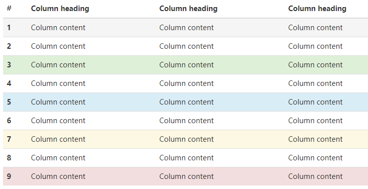
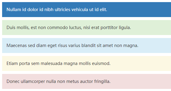
状态类
通过这些状态类可以为行或单元格设置颜色。
| 类名 | 描述 |
|---|---|
.active | 鼠标悬停在行或单元格上时所设置的颜色 |
.success | 标识成功或积极的动作 |
.info | 标识普通的提示信息或动作 |
.warning | 标识警告或需要用户注意 |
.danger | 标识危险或潜在的带来负面影响的动作 |
<!-- On rows -->
<tr class="active">...</tr>
<tr class="success">...</tr>
<tr class="warning">...</tr>
<tr class="danger">...</tr>
<tr class="info">...</tr>

<!-- On cells (`td` or `th`) -->
<tr>
  <td class="active">...</td>
  <td class="success">...</td>
  <td class="warning">...</td>
  <td class="danger">...</td>
  <td class="info">...</td>
</tr>
响应式表格
将任何 .table 元素包裹在 .table-responsive 元素内,即可创建响应式表格,其会在小屏幕设备上(小于768px)水平滚动。当屏幕大于 768px 宽度时,水平滚动条消失。

<div class="table-responsive">
      <table class="table table-bordered">
        <thead>
          <tr>
            <th>#</th>
            <th>Table heading</th>
            <th>Table heading</th>
            <th>Table heading</th>
            <th>Table heading</th>
            <th>Table heading</th>
            <th>Table heading</th>
          </tr>
        </thead>
        <tbody>
          <tr>
            <th scope="row">1</th>
            <td>Table cell</td>
            <td>Table cell</td>
            <td>Table cell</td>
            <td>Table cell</td>
            <td>Table cell</td>
            <td>Table cell</td>
          </tr>
          <tr>
            <th scope="row">2</th>
            <td>Table cell</td>
            <td>Table cell</td>
            <td>Table cell</td>
            <td>Table cell</td>
            <td>Table cell</td>
            <td>Table cell</td>
          </tr>
          <tr>
            <th scope="row">3</th>
            <td>Table cell</td>
            <td>Table cell</td>
            <td>Table cell</td>
            <td>Table cell</td>
            <td>Table cell</td>
            <td>Table cell</td>
          </tr>
        </tbody>
      </table>
</div>
表单
基本实例
单独的表单控件会被自动赋予一些全局样式。所有设置了 .form-control 类的 <input>、<textarea> 和 <select> 元素都将被默认设置宽度属性为 width: 100%;。 将 label 元素和前面提到的控件包裹在 .form-group 中可以获得最好的排列。
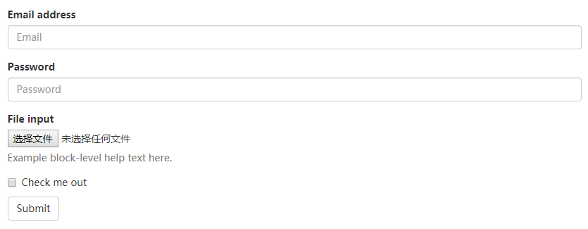
<form>
  <div class="form-group">
    <label for="exampleInputEmail1">Email address</label>
    <input type="email" class="form-control" id="exampleInputEmail1" placeholder="Email">
  </div>
  <div class="form-group">
    <label for="exampleInputPassword1">Password</label>
    <input type="password" class="form-control" id="exampleInputPassword1" placeholder="Password">
  </div>
  <div class="form-group">
    <label for="exampleInputFile">File input</label>
    <input type="file" id="exampleInputFile">
    <p class="help-block">Example block-level help text here.</p>
  </div>
  <div class="checkbox">
    <label>
      <input type="checkbox"> Check me out
    </label>
  </div>
  <button type="submit" class="btn btn-default">Submit</button>
</form>
注意
不要将表单组和输入框组混合使用
内联表单
为 <form> 元素添加 .form-inline 类可使其内容左对齐并且表现为 inline-block 级别的控件。只适用于视口(viewport)至少在 768px 宽度时(视口宽度再小的话就会使表单折叠)。
可能需要手动设置宽度
在 Bootstrap 中,输入框和单选/多选框控件默认被设置为 width: 100%; 宽度。在内联表单,我们将这些元素的宽度设置为 width: auto;,因此,多个控件可以排列在同一行。根据你的布局需求,可能需要一些额外的定制化组件。

<form class="form-inline">
  <div class="form-group">
    <label for="exampleInputName2">Name</label>
    <input type="text" class="form-control" id="exampleInputName2" placeholder="Jane Doe">
  </div>
  <div class="form-group">
    <label for="exampleInputEmail2">Email</label>
    <input type="email" class="form-control" id="exampleInputEmail2" placeholder="jane.doe@example.com">
  </div>
  <button type="submit" class="btn btn-default">Send invitation</button>
</form>
快速登录页面

<form class="form-inline">
  <div class="form-group">
    <label class="sr-only" for="exampleInputEmail3">Email address</label>
    <input type="email" class="form-control" id="exampleInputEmail3" placeholder="Email">
  </div>
  <div class="form-group">
    <label class="sr-only" for="exampleInputPassword3">Password</label>
    <input type="password" class="form-control" id="exampleInputPassword3" placeholder="Password">
  </div>
  <div class="checkbox">
    <label>
      <input type="checkbox"> Remember me
    </label>
  </div>
  <button type="submit" class="btn btn-default">Sign in</button>
</form>

<form class="form-inline">
  <div class="form-group">
    <label class="sr-only" for="exampleInputAmount">Amount (in dollars)</label>
    <div class="input-group">
      <div class="input-group-addon">$</div>
      <input type="text" class="form-control" id="exampleInputAmount" placeholder="Amount">
      <div class="input-group-addon">.00</div>
    </div>
  </div>
  <button type="submit" class="btn btn-primary">Transfer cash</button>
</form>
水平排列的表单
通过为表单添加 .form-horizontal 类,并联合使用 Bootstrap 预置的栅格类,可以将 label 标签和控件组水平并排布局。这样做将改变 .form-group 的行为,使其表现为栅格系统中的行(row),因此就无需再额外添加 .row 了。

<form class="form-horizontal">
  <div class="form-group">
    <label for="inputEmail3" class="col-sm-2 control-label">Email</label>
    <div class="col-sm-10">
      <input type="email" class="form-control" id="inputEmail3" placeholder="Email">
    </div>
  </div>
  <div class="form-group">
    <label for="inputPassword3" class="col-sm-2 control-label">Password</label>
    <div class="col-sm-10">
      <input type="password" class="form-control" id="inputPassword3" placeholder="Password">
    </div>
  </div>
  <div class="form-group">
    <div class="col-sm-offset-2 col-sm-10">
      <div class="checkbox">
        <label>
          <input type="checkbox"> Remember me
        </label>
      </div>
    </div>
  </div>
  <div class="form-group">
    <div class="col-sm-offset-2 col-sm-10">
      <button type="submit" class="btn btn-default">Sign in</button>
    </div>
  </div>
</form>
被支持的控件
表单布局实例中展示了其所支持的标准表单控件。
输入框
包括大部分表单控件、文本输入域控件,还支持所有 HTML5 类型的输入控件: text、password、datetime、datetime-local、date、month、time、week、number、email、url、search、tel 和 color。
必须添加类型声明
只有正确设置了 type 属性的输入控件才能被赋予正确的样式。

<input type="text" class="form-control" placeholder="Text input">
文本域

<textarea class="form-control" rows="3"></textarea>
多选和单选框
多选框(checkbox)用于选择列表中的一个或多个选项,而单选框(radio)用于从多个选项中只选择一个。
默认外观
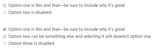
<div class="checkbox">
<label>
<input type="checkbox" value="">
Option one is this and that—be sure to include why it's great
</label>
</div>
<div class="checkbox disabled">
<label>
<input type="checkbox" value="" disabled>
Option two is disabled
</label>
</div>
<div class="radio">
<label>
<input type="radio" name="optionsRadios" id="optionsRadios1" value="option1" checked>
Option one is this and that—be sure to include why it's great
</label>
</div>
<div class="radio">
<label>
<input type="radio" name="optionsRadios" id="optionsRadios2" value="option2">
Option two can be something else and selecting it will deselect option one
</label>
</div>
<div class="radio disabled">
<label>
<input type="radio" name="optionsRadios" id="optionsRadios3" value="option3" disabled>
Option three is disabled
</label>
</div>
内联单选和多选框
通过将 .checkbox-inline 或 .radio-inline 类应用到一系列的多选框(checkbox)或单选框(radio)控件上,可以使这些控件排列在一行。

<label class="checkbox-inline">
  <input type="checkbox" id="inlineCheckbox1" value="option1"> 1
</label>
<label class="checkbox-inline">
  <input type="checkbox" id="inlineCheckbox2" value="option2"> 2
</label>
<label class="checkbox-inline">
  <input type="checkbox" id="inlineCheckbox3" value="option3"> 3
</label>

<label class="radio-inline">
  <input type="radio" name="inlineRadioOptions" id="inlineRadio1" value="option1"> 1
</label>
<label class="radio-inline">
  <input type="radio" name="inlineRadioOptions" id="inlineRadio2" value="option2"> 2
</label>
<label class="radio-inline">
  <input type="radio" name="inlineRadioOptions" id="inlineRadio3" value="option3"> 3
</label>
下拉列表(select)

<select class="form-control">
  <option>1</option>
  <option>2</option>
  <option>3</option>
  <option>4</option>
  <option>5</option>
</select>
对于标记了 multiple 属性的 <select> 控件来说,默认显示多选项。

<select multiple class="form-control">
  <option>1</option>
  <option>2</option>
  <option>3</option>
  <option>4</option>
  <option>5</option>
</select>
静态控件
如果需要在表单中将一行纯文本和 label 元素放置于同一行,为
元素添加 .form-control-static 类即可。

<form class="form-horizontal">
  <div class="form-group">
    <label class="col-sm-2 control-label">Email</label>
    <div class="col-sm-10">
      <p class="form-control-static">email@example.com</p>
    </div>
  </div>
  <div class="form-group">
    <label for="inputPassword" class="col-sm-2 control-label">Password</label>
    <div class="col-sm-10">
      <input type="password" class="form-control" id="inputPassword" placeholder="Password">
    </div>
  </div>
</form>

<form class="form-inline">
  <div class="form-group">
    <label class="sr-only">Email</label>
    <p class="form-control-static">email@example.com</p>
  </div>
  <div class="form-group">
    <label for="inputPassword2" class="sr-only">Password</label>
    <input type="password" class="form-control" id="inputPassword2" placeholder="Password">
  </div>
  <button type="submit" class="btn btn-default">Confirm identity</button>
</form>
校验状态
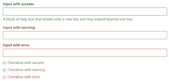
<div class="form-group has-success">
  <label class="control-label" for="inputSuccess1">Input with success</label>
  <input type="text" class="form-control" id="inputSuccess1" aria-describedby="helpBlock2">
  <span id="helpBlock2" class="help-block">A block of help text that breaks onto a new line and may extend beyond one line.</span>
</div>
<div class="form-group has-warning">
  <label class="control-label" for="inputWarning1">Input with warning</label>
  <input type="text" class="form-control" id="inputWarning1">
</div>
<div class="form-group has-error">
  <label class="control-label" for="inputError1">Input with error</label>
  <input type="text" class="form-control" id="inputError1">
</div>
<div class="has-success">
  <div class="checkbox">
    <label>
      <input type="checkbox" id="checkboxSuccess" value="option1">
      Checkbox with success
    </label>
  </div>
</div>
<div class="has-warning">
  <div class="checkbox">
    <label>
      <input type="checkbox" id="checkboxWarning" value="option1">
      Checkbox with warning
    </label>
  </div>
</div>
<div class="has-error">
  <div class="checkbox">
    <label>
      <input type="checkbox" id="checkboxError" value="option1">
      Checkbox with error
    </label>
  </div>
</div>
为水平排列的表单和内联表单设置可选的图标

<form class="form-horizontal">
  <div class="form-group has-success has-feedback">
    <label class="control-label col-sm-3" for="inputSuccess3">Input with success</label>
    <div class="col-sm-9">
      <input type="text" class="form-control" id="inputSuccess3" aria-describedby="inputSuccess3Status">
      <span class="glyphicon glyphicon-ok form-control-feedback" aria-hidden="true"></span>
      <span id="inputSuccess3Status" class="sr-only">(success)</span>
    </div>
  </div>
  <div class="form-group has-success has-feedback">
    <label class="control-label col-sm-3" for="inputGroupSuccess2">Input group with success</label>
    <div class="col-sm-9">
      <div class="input-group">
        <span class="input-group-addon">@</span>
        <input type="text" class="form-control" id="inputGroupSuccess2" aria-describedby="inputGroupSuccess2Status">
      </div>
      <span class="glyphicon glyphicon-ok form-control-feedback" aria-hidden="true"></span>
      <span id="inputGroupSuccess2Status" class="sr-only">(success)</span>
    </div>
  </div>
</form>

<form class="form-inline">
  <div class="form-group has-success has-feedback">
    <label class="control-label" for="inputSuccess4">Input with success</label>
    <input type="text" class="form-control" id="inputSuccess4" aria-describedby="inputSuccess4Status">
    <span class="glyphicon glyphicon-ok form-control-feedback" aria-hidden="true"></span>
    <span id="inputSuccess4Status" class="sr-only">(success)</span>
  </div>
</form>
<form class="form-inline">
  <div class="form-group has-success has-feedback">
    <label class="control-label" for="inputGroupSuccess3">Input group with success</label>
    <div class="input-group">
      <span class="input-group-addon">@</span>
      <input type="text" class="form-control" id="inputGroupSuccess3" aria-describedby="inputGroupSuccess3Status">
    </div>
    <span class="glyphicon glyphicon-ok form-control-feedback" aria-hidden="true"></span>
    <span id="inputGroupSuccess3Status" class="sr-only">(success)</span>
  </div>
</form>
控件尺寸
通过 .input-lg 类似的类可以为控件设置高度,通过 .col-lg-* 类似的类可以为控件设置宽度。

<input class="form-control input-lg" type="text" placeholder=".input-lg">
<input class="form-control" type="text" placeholder="Default input">
<input class="form-control input-sm" type="text" placeholder=".input-sm">

<select class="form-control input-lg">...</select>
<select class="form-control">...</select>
<select class="form-control input-sm">...</select>
水平排列的表单组的尺寸
通过添加 .form-group-lg 或 .form-group-sm 类,为 .form-horizontal 包裹的 label 元素和表单控件快速设置尺寸。

<form class="form-horizontal">
  <div class="form-group form-group-lg">
    <label class="col-sm-2 control-label" for="formGroupInputLarge">Large label</label>
    <div class="col-sm-10">
      <input class="form-control" type="text" id="formGroupInputLarge" placeholder="Large input">
    </div>
  </div>
  <div class="form-group form-group-sm">
    <label class="col-sm-2 control-label" for="formGroupInputSmall">Small label</label>
    <div class="col-sm-10">
      <input class="form-control" type="text" id="formGroupInputSmall" placeholder="Small input">
    </div>
  </div>
</form>
调整列(column)尺寸
用栅格系统中的列(column)包裹输入框或其任何父元素,都可很容易的为其设置宽度。

<div class="row">
  <div class="col-xs-2">
    <input type="text" class="form-control" placeholder=".col-xs-2">
  </div>
  <div class="col-xs-3">
    <input type="text" class="form-control" placeholder=".col-xs-3">
  </div>
  <div class="col-xs-4">
    <input type="text" class="form-control" placeholder=".col-xs-4">
  </div>
</div>
按钮
可作为按钮使用的标签或元素
为 <a>、<button> 或 <input> 元素添加按钮类(button class)即可使用 Bootstrap 提供的样式。

<a class="btn btn-default" href="#" role="button">Link</a>
<button class="btn btn-default" type="submit">Button</button>
<input class="btn btn-default" type="button" value="Input">
<input class="btn btn-default" type="submit" value="Submit">
预定义样式
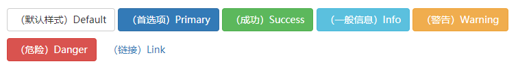
<!-- Standard button -->
<button type="button" class="btn btn-default">(默认样式)Default</button>

<!-- Provides extra visual weight and identifies the primary action in a set of buttons -->
<button type="button" class="btn btn-primary">(首选项)Primary</button>

<!-- Indicates a successful or positive action -->
<button type="button" class="btn btn-success">(成功)Success</button>

<!-- Contextual button for informational alert messages -->
<button type="button" class="btn btn-info">(一般信息)Info</button>

<!-- Indicates caution should be taken with this action -->
<button type="button" class="btn btn-warning">(警告)Warning</button>

<!-- Indicates a dangerous or potentially negative action -->
<button type="button" class="btn btn-danger">(危险)Danger</button>

<!-- Deemphasize a button by making it look like a link while maintaining button behavior -->
<button type="button" class="btn btn-link">(链接)Link</button>
尺寸
需要让按钮具有不同尺寸吗?使用 .btn-lg、.btn-sm 或 .btn-xs 就可以获得不同尺寸的按钮。
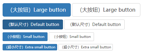
<p>
  <button type="button" class="btn btn-primary btn-lg">(大按钮)Large button</button>
  <button type="button" class="btn btn-default btn-lg">(大按钮)Large button</button>
</p>
<p>
  <button type="button" class="btn btn-primary">(默认尺寸)Default button</button>
  <button type="button" class="btn btn-default">(默认尺寸)Default button</button>
</p>
<p>
  <button type="button" class="btn btn-primary btn-sm">(小按钮)Small button</button>
  <button type="button" class="btn btn-default btn-sm">(小按钮)Small button</button>
</p>
<p>
  <button type="button" class="btn btn-primary btn-xs">(超小尺寸)Extra small button</button>
  <button type="button" class="btn btn-default btn-xs">(超小尺寸)Extra small button</button>
</p>
通过给按钮添加 .btn-block 类可以将其拉伸至父元素100%的宽度,而且按钮也变为了块级(block)元素。

<button type="button" class="btn btn-primary btn-lg btn-block">(块级元素)Block level button</button>
<button type="button" class="btn btn-default btn-lg btn-block">(块级元素)Block level button</button>
图片
响应式图片
通过为图片添加 .img-responsive 类可以让图片支持响应式布局。其实质是为图片设置了 max-width: 100%;、 height: auto; 和 display: block; 属性,从而让图片在其父元素中更好的缩放。
如果需要让使用了 .img-responsive 类的图片水平居中,请使用 .center-block 类,不要用 .text-center。 请参考助手类章节 了解更多关于 .center-block 的用法。
<img src="..." class="img-responsive" alt="响应式图片">
图片形状
通过为 <img> 元素添加以下相应的类,可以让图片呈现不同的形状。
跨浏览器兼容性
请时刻牢记:Internet Explorer 8 不支持 CSS3 中的圆角属性。

<img src="..." alt="..." class="img-rounded">
<img src="..." alt="..." class="img-circle">
<img src="..." alt="..." class="img-thumbnail">
辅助类
情境文本颜色
通过颜色来展示意图,Bootstrap 提供了一组工具类。这些类可以应用于链接,并且在鼠标经过时颜色可以还可以加深,就像默认的链接一样。
<p class="text-muted">...</p>
<p class="text-primary">...</p>
<p class="text-success">...</p>
<p class="text-info">...</p>
<p class="text-warning">...</p>
<p class="text-danger">...</p>
情境背景色
和情境文本颜色类一样,使用任意情境背景色类就可以设置元素的背景。链接组件在鼠标经过时颜色会加深,就像上面所讲的情境文本颜色类一样。
<p class="bg-primary">...</p>
<p class="bg-success">...</p>
<p class="bg-info">...</p>
<p class="bg-warning">...</p>
<p class="bg-danger">...</p>
关闭按钮
通过使用一个象征关闭的图标,可以让模态框和警告框消失。

<button type="button" class="close"><span>×</span></button>
快速浮动
通过添加一个类,可以将任意元素向左或向右浮动。!important 被用来明确 CSS 样式的优先级
<div class="pull-left">...</div>
<div class="pull-right">...</div>
让内容块居中
<div class="center-block">...</div>
清除浮动
<div class="clearfix">...</div>
显示或隐藏内容
<div class="show">...</div>
<div class="hidden">...</div>
<div class="invisible ">...</div>
<h1 class="text-hide">...</h1>
bootstrap对应的css代码
.show {
  display: block !important;
}
.hidden {
  display: none !important;
}
.invisible {
  visibility: hidden;
}
.text-hide {
    font: 0/0 a;
    color: transparent;
    text-shadow: none;
    background-color: transparent;
    border: 0;
}